download transaction history files
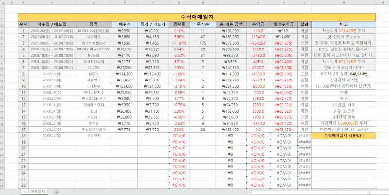
Referring to the previously posted confirmation post of the transaction details of Korea Investment & Securities (https://blog.naver.com/my712/222590572040) ), we will graph the transaction and sale of certain stocks.

Check the details of overseas stock transactions of Korea Investment & Securities.I’d like to select a breakdown of overseas stock transactions on the Korea Investment & Securities website and look at them in Excel Mainly overseas at Korea Investment & Securities… blog.naver.com
인기글


At the end of the post, you could download the transaction details from Excel as an Excel file. The name of the file will go down to trade_list.xls. A code description is advanced based on the location in a folder such as a Python code to be created.Today’s graph shows the acquisition price on the day of QYLD acquisition as follows.
Required Modules
Let’s start by writing down the list of modules we need today in advance.
Import the panda as pdimport matplotlib Date from pyplot as pltimport matplotlib.dates datetime Import datetime

Load the xls file
Already a built-in function in pandas The can read files in read_excel. If you have the trade_list.xls file in the same location as the Python code, read the file and save it to the trade_data variable as follows.

trade_file = ‘trade_list.xls’ # 파일 이름 trade_data = pd.read_excel(trade_file, index_col=0)

If only read_excel (filename) is used, the file is called to DataFrame once. However, if you read it as it is, the index is set to the number sequentially as follows.
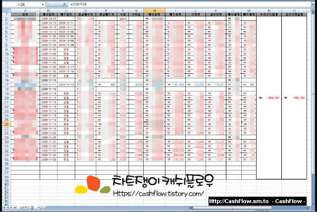
When you open trade_data, you can see that the Index is set to a number.

Accordingly, index_col=0 is set so that the transaction date becomes index. Only then can the acquisition graph be drawn by date.

“Trading date” is now indexselect a record of the brand and number of items one wantsIn this post, I would like to graph QYLD’s acquisition record. Therefore, you can find “overseas securities acquisition USD” as the type of trade data transaction and find “Global X NASDAQ-100 COVERED CALL ETF”, the official name of QYLD, as the name of the stock.In other words, you can choose index, the type of transaction is USD for overseas securities acquisition and the name of the stock is Global X NASDAQ-100 COVERED CALL ETF.Let’s select a QYLD acquisition date.Write the code as follows to find the index of the QYLD acquisition date and omit the acquisition date and transaction unit price information.code = ‘GLOBAL X NASDAQ-100 COVERED CALL ETF’ # QYLD 이름 qyld_idx = (trade_data[‘종목명’]==code) & (trade_data[‘거래종류’]==’해외증권매수 USD’) # QYLD 의 매수 발생 indexqyld_buy= trade_data.loc[qyld_idx,:] # QYLD매수만 따로 뽑아낸 DataFrame_Date= (qytime_datelist(qydatydatydat)로 만듦)으로 변환 후.to_numeric( qyld_buy[‘거래단가’]) # 거래단가 USDcode = ‘GLOBAL X NASDAQ-100 COVERED CALL ETF’ # QYLD 이름 qyld_idx = (trade_data[‘종목명’]==code) & (trade_data[‘거래종류’]==’해외증권매수 USD’) # QYLD 의 매수 발생 indexqyld_buy= trade_data.loc[qyld_idx,:] # QYLD매수만 따로 뽑아낸 DataFrame_Date= (qytime_datelist(qydatydatydat)로 만듦)으로 변환 후.to_numeric( qyld_buy[‘거래단가’]) # 거래단가 USDAll data has been cleaned up. Let’s draw a graph.Drawing a graph is a transaction unit price based on the date, so you can plot it with qyld_Data and qyld_price. The following code allows you to draw the graph correctly first. However, it can be seen that the x-axis labels overlap each other.fig,ax = plt.subplots(1,1,dpi = 200) #FigureObjectDeclaration and ax.plot(qyld_Date, qyld_price, ‘-o’) #graph drawingfig,ax = plt.subplots(1,1,dpi = 200) #FigureObjectDeclaration and ax.plot(qyld_Date, qyld_price, ‘-o’) #graph drawingThe x-axis labels overlap each other is very ugly.If you set it as appropriate as below, you will be able to draw an appropriate completion graph.If you set it as appropriate as below, you will be able to draw an appropriate completion graph.ax.xaxis.set_major_formatter(mdates.).DateFormatter(‘%b’) # 월로 x축 tick 표시# 21-Jan 형식으로 표시 : ‘%y-%b’# 2021-01 형식으로 표시 : ‘%Y-%m’ax.tick_params(axis = ‘x’, label rotation) = 90) # x축 label 90 도 표ax.set_xlim([datetime(2021, 1, 12, 31)]), datetime(2021, 12, 31) # 축 범위.gridrid(True-tax.title_title(AX_ax_。set_ylabel (‘$’)plt.show ()This is the transaction unit price of QYLD that I bought this year. I have been buying since the middle of April.overall codeImport the panda as the pimport metric port metric.datltlib.dat time.dat time.dat time.dat time.dat time.dat time 읽기 trade_file = ‘trade_list.xls’ # 파일름trade_data= pd.ad_exe_____________________________FACE_FACE_== == Data]해외증권매수) #QLD のインデックスを購入する.loc[qyld_idx,:]# QYLD 매수만 따로 뽑아낸 DataFrameqyld_Date = list(pd.to _datetime(qyld_buy.index))# qyld_buy 에서 매수 날짜를 type 으로 변환 후 list 로 만듦qyld_price=pd.to _거래단가(qyld_price[‘numeric’])#%%그래프 그리기fig,ax=plt.subplotsubplotsubplots(1, dpi200)#qldprice-xqldprice.그래프 그리기, y.set_major_formatter(mdates.).DateFormatter(‘%b’) # 월로 x축 tick 표시# 21-Jan 형식으로 표시 : ‘%y-%b’# 2021-01 형식으로표d :% Y-%m’s “x’s axis=”; bell rotation = = 90) # x축 label 90 도 표ax.set_xlim([datetime(2021, 1, 12, 31)]), datetime(2021, 12, 31) # 축 범위.gridrid(True-tax.title_title(AX_ax_。set_ylabel (‘$’)plt.show ()Import the panda as pdimport matplotlib, where pyplot as pltimport matplotlib.dates is datetime import datetime# %% 파일 읽기 trade_file = ‘trade_list.xls’ # 파일 이름trade_data = pd.read_excel(trade_file, index_col=0) code= ‘Global X NASDAQ-100 covered call ETF’ #QYLD_idx= (trade_data[종목명’]== Data]해외증권매수) Purchase index for #QLD.loc[qyld_idx,:]# QYLD 매수만 따로 뽑아낸 DataFrameqyld_Date = list(pd.to _datetime(qyld_buy.index))# qyld_buy 에서 매수 날짜를 type 으로 변환 후 list 로 만듦qyld_price=pd.to _거래단가(qyld_price[‘numeric’])#%%그래프 그리기fig,ax=plt.subplotsubplotsubplots(1, dpi200)#qldprice-xqldprice.그래프 그리기, y.set_major_formatter(mdates.).DateFormatter(‘%b’) # 월로 x축 tick 표시# 21-Jan 형식으로 표시 : ‘%y-%b’# 2021-01 형식으로 표시 : ‘%Y-%m’ax.tick_params(axis = ‘x’, label rotation) = 90) # x축 label 90 도 표ax.set_xlim([datetime(2021, 1, 12, 31)]), datetime(2021, 12, 31) # 축 범위.gridrid(True-tax.title_title(AX_ax_。set_ylabel (‘$’)plt.show ()Import the panda as pdimport matplotlib, where pyplot as pltimport matplotlib.dates is datetime import datetime# %% 파일 읽기 trade_file = ‘trade_list.xls’ # 파일 이름trade_data = pd.read_excel(trade_file, index_col=0) code= ‘Global X NASDAQ-100 covered call ETF’ #QYLD_idx= (trade_data[종목명’]== Data]해외증권매수) Purchase index for #QLD.loc[qyld_idx,:]# QYLD 매수만 따로 뽑아낸 DataFrameqyld_Date = list(pd.to _datetime(qyld_buy.index))# qyld_buy 에서 매수 날짜를 type 으로 변환 후 list 로 만듦qyld_price=pd.to _거래단가(qyld_price[‘numeric’])#%%그래프 그리기fig,ax=plt.subplotsubplotsubplots(1, dpi200)#qldprice-xqldprice.그래프 그리기, y.set_major_formatter(mdates.).DateFormatter(‘%b’) # 월로 x축 tick 표시# 21-Jan 형식으로 표시 : ‘%y-%b’# 2021-01 형식으로 표시 : ‘%Y-%m’ax.tick_params(axis = ‘x’, label rotation) = 90) # x축 label 90 도 표ax.set_xlim([datetime(2021, 1, 12, 31)]), datetime(2021, 12, 31) # 축 범위.gridrid(True-tax.title_title(AX_ax_。set_ylabel (‘$’)plt.show ()